I have recently undertaken the endeavor of learning biblical Hebrew. The first step, naturally, was to learn the Hebrew alphabet. Because it uses a completely different character system (besides reading right to left) it has been like stepping into a whole new, thrilling world. In this new world, which I entered thoroughly motivated by my inner Bible nerd, my inner design nerd found ample opportunity to jump out and convene with the other.
Hebrew letters are, in my opinion quite elegant. In their various forms they accomplish both simplicity and complexity, each beautiful in their own right. At their most decorative, they have natural curves which flow and dance, making the text seem alive with exuberance. However, with so many swashes and marks, they can also seem rather overwhelming to a total newcomer. Thankfully, there is a much simplified version of each letter to make quick handwriting possible. As with English letters, there are book-print and handwritten (as well as cursive) versions for each letter, and as such it is possible to encounter a wide variety of interpretations (as with English) for each letter.
Just for reference, here is the alphabet in a sans-serif font:
א ב ג ד ה ו ז ח ט י כ ל מ נ ס ע פ צ ק ר ש ת
And again in a serif font:
א ב ג ד ה ו ז ח ט י כ ל מ נ ס ע פ צ ק ר ש ת
Studying all the various manifestations of each letter from a typographical perspective proved to be very helpful in understanding the underlying anatomy...the core structure of each one. That, in turn, was a major aid in memorization and recognition.
During this process, I first explored the most simplified, perfectly geometric possibilities for each letter, and came up with my own prototype for a "font" that is pleasing to me, using a standardized grid and 3 weights:
 I then decided to get creative going in the opposite direction, and came up with a flowy, uninhibited interpretation of each character:

After that, I took it a step further and played around with color and shading to take the above concept and give it a three-dimensional, textured feel using digital paint:

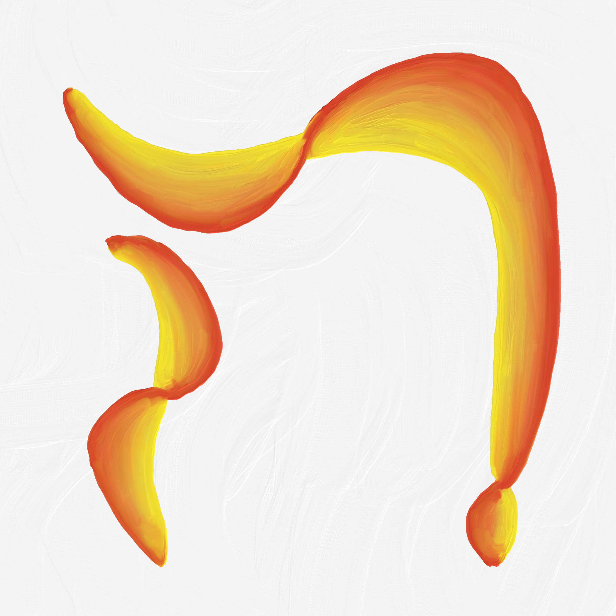
I haven't completed the painted collection yet, those are just two of my favorites so far. I will probably continue to work on them gradually just for the sake of the joy it brings me.